In the world of academic and professional research, clarity is currency. The ability to communicate complex data in an understandable, visually engaging way has become an essential skill across disciplines—from social sciences to biomedical engineering. Data visualization bridges the gap between statistical rigor and human understanding, transforming spreadsheets into stories and numbers into narratives. Yet, creating effective visualizations requires more than technical proficiency with software; it calls for an ethical, aesthetic, and cognitive awareness of how people perceive and interpret information.
This essay explores the art and science of data visualization: how to choose the right format for your data, avoid misleading visuals, ensure accessibility for diverse audiences, and integrate visual elements meaningfully into academic writing. Along the way, we will examine examples of effective and flawed visualizations and summarize key strategies in a comparative table.
The Purpose of Visualization in Research Communication
At its core, data visualization serves two fundamental goals: to clarify and to persuade. Good visuals make relationships between variables immediately visible, highlighting trends, anomalies, or correlations that might be buried in raw data. In academic research, visualizations are not decorative—they are cognitive tools that structure the reader’s understanding.
For example, a scatterplot that reveals a nonlinear relationship between hours studied and test scores can communicate more instantly and intuitively than several paragraphs of description. Likewise, a bar chart comparing survey responses across demographics provides immediate context that words alone cannot capture.
Yet, while the goal of visualization is to aid comprehension, it can also unintentionally distort it. When scale, color, or design are mishandled, visuals may exaggerate effects or conceal variability. Thus, the researcher’s responsibility extends beyond technical precision; it involves visual ethics—ensuring that every chart or figure truthfully represents the data’s meaning.
Modern visualization software such as Tableau, R (ggplot2), Python (Matplotlib, Seaborn), or even Excel makes it easy to produce sophisticated graphs. However, the ease of creation does not guarantee quality of communication. The principle of data–ink ratio, introduced by Edward Tufte, reminds us that every pixel should serve a purpose. Simplicity is not a constraint but a moral choice—to avoid overwhelming or misleading the audience.
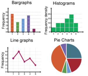
Choosing the Right Chart for the Right Story
Every dataset contains a story, but not every story is told best with the same type of visualization. The decision depends on the nature of variables, intended message, and audience literacy.
The following table summarizes common visualization types, their best-use cases, and frequent pitfalls.
| Visualization Type | Best Used For | Strengths | Common Mistakes |
|---|---|---|---|
| Bar Chart | Comparing discrete categories (e.g., survey responses, region-wise sales) | Clear, simple, easy to read | Inconsistent axis scales, excessive color use |
| Line Graph | Showing trends over time | Highlights change and direction effectively | Overplotting too many lines, unclear legends |
| Scatterplot | Exploring relationships between two continuous variables | Reveals patterns, outliers, correlations | Omitted regression lines, overcrowding |
| Pie Chart | Showing proportions or parts of a whole | Simple, intuitive for few categories | Misleading when used with too many slices or similar colors |
| Histogram | Displaying frequency distributions | Shows spread and central tendency | Poor bin size, non-zero axis manipulation |
| Heat Map | Visualizing multivariate data or intensity | Compact representation of large data | Poor color contrast, misinterpreted scales |
| Box Plot | Summarizing variability and outliers | Precise statistical representation | Misunderstood by general audiences |
| Network Graph | Displaying relationships (e.g., social, biological, computational networks) | Shows complex connections | Overly dense visuals, difficult labeling |
The goal is always to align visualization type with communication intent. A researcher must ask: Do I want to compare, show change, reveal distribution, or explain structure? Misalignment leads to confusion. For example, a pie chart attempting to depict time-series data confuses proportion with progression.
Choosing the right format also depends on audience expertise. Specialists may appreciate box plots or violin plots for detailed statistical nuance, whereas general readers may prefer bar graphs or line charts for clarity.
A well-chosen visualization serves as both a summary and a gateway—it allows readers to grasp the essence of results while inviting them to explore deeper analysis in the accompanying text.
Avoiding Misleading Visuals: Ethics and Integrity in Data Representation
Visualizations carry immense persuasive power. As Tufte and other data theorists have argued, a dishonest graph can mislead as effectively as a falsified dataset. The danger lies not only in overt manipulation but also in subtle design choices: truncated axes, distorted proportions, or deceptive color gradients can all shift perception.
One common ethical lapse is the truncated y-axis. When a bar chart begins not at zero but at a higher value, differences between categories appear exaggerated. For instance, showing an increase in unemployment from 5.0% to 5.5% might look like a dramatic spike if the y-axis starts at 4.8%. The graph is factually correct but visually deceptive.
Color choice also plays a role. Red may imply danger or decline, while green suggests growth or success—psychological cues that can bias interpretation. Using consistent, neutral color palettes (like grayscale with accent tones) can help mitigate emotional distortion.
Another frequent issue is data density—cramming too much information into one figure. While advanced visualizations like heat maps or 3D charts can handle complex datasets, they risk overwhelming the viewer. Cognitive overload reduces comprehension and trust. Effective design requires restraint.
Moreover, accessibility must not be overlooked. Visuals should be interpretable by people with color vision deficiencies or visual impairments. Tools like Color Oracle or built-in colorblind simulators in design software can test for accessibility. Including alternative text (alt-text) and descriptive captions also supports inclusive research communication.
Finally, transparency demands clear labeling and documentation. Every axis, symbol, and color should have a meaning explained in the caption. The caption, often underrated, bridges the visual and textual worlds—guiding interpretation without repeating data.
Integrating Visualizations into Academic Writing
Visualizations should not exist in isolation; they should function as integral components of argumentation. In scholarly writing, figures and tables interact with narrative, reinforcing claims or illustrating theoretical frameworks. The challenge lies in balancing visual and textual elements to maintain coherence.
A good research paper weaves visuals into its structure seamlessly. Each figure should be introduced, interpreted, and referenced explicitly in the text. For example:
“As shown in Figure 2, the correlation between study time and test performance follows a logarithmic pattern, suggesting diminishing returns beyond eight hours of preparation.”
This framing not only orients the reader but also demonstrates that the author understands the data beyond mere presentation.
The positioning of visuals also matters. Academic conventions usually place figures near their first mention to minimize back-and-forth reading. Consistency in numbering (Figure 1, Figure 2, etc.) ensures navigability.
Furthermore, visual hierarchy aids comprehension. Key results should receive visual emphasis—either through placement (early in results sections) or through design (highlighted lines, annotations, callouts). Peripheral data, such as control tests or sensitivity analyses, can be relegated to appendices or supplementary materials.
Another consideration is visual style alignment. A paper combining minimalist graphs with dense, text-heavy tables can appear disjointed. Maintaining stylistic coherence—consistent fonts, colors, and line weights—creates a professional impression and enhances readability.
Finally, with the rise of digital publishing, visualizations have evolved from static to interactive. Journals and repositories now support dynamic plots, enabling readers to toggle variables, zoom into data subsets, or view confidence intervals interactively. Such innovation democratizes data interpretation and invites active engagement with research.
The Cognitive Science of Seeing: Why Design Matters
Behind every successful visualization lies an understanding of how the human brain processes information. Cognitive psychology and perceptual studies provide valuable insights into why certain visual formats work better than others.
Humans excel at detecting spatial differences—length, position, and direction—but struggle with decoding area, volume, or color gradients accurately. That’s why bar charts often outperform pie charts for precise comparison. The brain can easily compare bar lengths but misjudges angles or circle areas.
Similarly, Gestalt principles—proximity, similarity, continuity—govern how we perceive visual groups. Charts designed according to these principles guide the viewer’s eye naturally, reducing mental effort.
Color theory also affects comprehension. Warm hues (red, orange) attract attention; cool hues (blue, green) recede. Strategic color use can highlight key points, but overuse creates noise.
Moreover, the dual-coding theory in educational psychology suggests that combining verbal and visual information enhances retention. Well-designed figures reinforce memory, turning abstract results into concrete mental images.
These principles explain why good visual design is not superficial—it’s epistemological. Design choices shape what the audience sees and remembers, influencing how knowledge itself is constructed and disseminated.
Case Studies: When Visuals Illuminate—and When They Mislead
To understand the power and peril of data visualization, it’s worth examining two real-world examples.
In 1854, John Snow’s cholera map became a landmark in both epidemiology and visual reasoning. By plotting cholera cases around a London water pump, Snow revealed a spatial pattern that textual statistics had obscured. His simple map directly led to identifying contaminated water as the disease’s source—a triumph of visualization as scientific discovery.
Conversely, the “flatten the curve” chart during the COVID-19 pandemic illustrated how clear visuals can drive public behavior. Without complex data, the simple overlapping curves communicated urgency and preventive strategy effectively to a global audience.
On the other hand, misleading pandemic graphs—particularly those with manipulated scales or inconsistent baselines—showed how visual rhetoric can distort public understanding. Some media outlets used truncated axes or omitted time frames to make infection rates appear more dramatic or less concerning, depending on their agenda.
These contrasting cases remind us that visualization is never neutral. It is a rhetorical act—a choice about what to show, what to omit, and how to frame relationships. The ethical researcher must remain conscious of this power.
The Future of Visualization: AI, Automation, and Interactive Narratives
The next frontier of data visualization lies at the intersection of automation, interactivity, and narrative design. Artificial intelligence now assists researchers in identifying optimal chart types, detecting outliers, and generating dynamic dashboards. Tools like Flourish, Observable, and Datawrapper democratize visualization creation even for non-specialists.
However, automation introduces new ethical challenges. When algorithms decide visual form, they also encode assumptions about what matters. Researchers must critically assess these tools, ensuring that automated visualizations do not prioritize aesthetics over accuracy.
Interactive storytelling platforms now blend data with narrative. Readers can scroll through datasets, manipulate parameters, or visualize outcomes dynamically. This approach transforms research into a participatory experience—a trend known as data journalism meets academia.
In the coming decade, we can expect more hybrid forms: interactive scientific papers, visual abstracts, and 3D data explorations in virtual or augmented reality. Yet, the underlying principle remains unchanged—clarity, honesty, and accessibility are the heart of good visualization.
Conclusion: Seeing with Integrity
Effective data visualization stands at the crossroads of art, science, and ethics. It demands technical skill, aesthetic sensibility, and moral responsibility. In an era saturated with information, the clarity of visual communication determines whether knowledge enlightens or misleads.
Researchers must remember that visuals are not ornaments but arguments. Each chart, graph, or table is a claim about reality, carrying interpretive weight. By choosing appropriate formats, maintaining transparency, ensuring accessibility, and integrating visuals seamlessly into writing, we turn data into dialogue—bridging the gap between discovery and understanding.
Ultimately, the goal of visualization is not to impress but to express; not to simplify data, but to make complexity comprehensible. When done well, it fulfills the oldest promise of science—to make the invisible visible.